Saturday 27 March 2010

Evaluation Question 4
How did you use media technologies in the construction and research, planning and evaluation stages?


When we began our media project, we had to do in depth research to ensure that we made products that would fit in with today's existing products. We used the platform youtube to find existing music videos, to analyse and look at for inspiration. We also used the internet to do research into existing digipak's, magazine adverts and other information
The equipment we needed for filming was; a camcorder, a camera, a tripod and a tape. We took our footage and then using an apple computer and the software Final Cut we edited the footage, and put the audio track with it to create a music video. Below I have shown how we used Final Cut to create our music video.


Link: Editing


I have identified and evaluated the ways in which I created products, but other software was used by other members of my group, for example Hennie used Photoshop to complete the digipak, and Kelsey used Dreamweaver to create the website.
Evaluation Question 3
What have you learned from your audience feedback?
When we set out to create this music video, we obviously wanted it to be as professional looking as possible, we wanted people to look at our product and be impressed with it, and respond to it like they would a real music video. So throughout the process of creating the music video we had helpful feedback from our teacher in ways to improve the product, which resulted in our final cut. I have documented our teachers opinions on our music video throughout this project, which has helped us developing and changing it, her opinion on our rough cuts, and her opinion on our storyline. Her knowledge and understanding of the media industry has helped us to create a successful product which our group can be proud of.
We posted our final cut of our music video on a social networking site to gain comments from teenagers within our target market of 17-30, there were female comments as well as male comments, giving our group a wide spectrum of viewers reactions to the video.
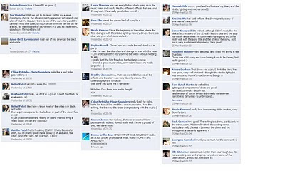
Below I have typed out some of the comments into quotes:
I think the reaction was incredibly positive, and shows that it was definitely a good decision to develop the introduction of the video from the first rough cut to the final video, the strobe lighted shots have high impact, and open the video with exciting, fast paced gripping shots, sure to captivate an audience, and secure their interest in the video and the music. Obviously there are always improvements to be made which has been highlighted by our feedback, some more locations could be used, the blink effect perhaps did not work as well as we thought, and some performance material could have been used perhaps lip syncing.
When we set out to create this music video, we obviously wanted it to be as professional looking as possible, we wanted people to look at our product and be impressed with it, and respond to it like they would a real music video. So throughout the process of creating the music video we had helpful feedback from our teacher in ways to improve the product, which resulted in our final cut. I have documented our teachers opinions on our music video throughout this project, which has helped us developing and changing it, her opinion on our rough cuts, and her opinion on our storyline. Her knowledge and understanding of the media industry has helped us to create a successful product which our group can be proud of.
We posted our final cut of our music video on a social networking site to gain comments from teenagers within our target market of 17-30, there were female comments as well as male comments, giving our group a wide spectrum of viewers reactions to the video.

Below I have typed out some of the comments into quotes:
Elle Kitchener: (aged 18) 'So much better than your rough cut. It's more exciting now and gripping. Very clever some of the camera work, shows skill. well done' |
I think the reaction was incredibly positive, and shows that it was definitely a good decision to develop the introduction of the video from the first rough cut to the final video, the strobe lighted shots have high impact, and open the video with exciting, fast paced gripping shots, sure to captivate an audience, and secure their interest in the video and the music. Obviously there are always improvements to be made which has been highlighted by our feedback, some more locations could be used, the blink effect perhaps did not work as well as we thought, and some performance material could have been used perhaps lip syncing.
"It reminds me a bit of Vlad the Impaler, think its because of the dark story and the camera shots"
- This is a key quote as the music video Vlad the Impaler was a huge inspiration for our video.
Thursday 25 March 2010


Evaluation Question 1
In what ways does your media product use, develop or challenge forms and conventions of real media products?
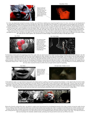
Below are nine key shots from our music video, which have been annotated, and compared with existing media products to show how we have used, developed and challenged forms and conventions of real mediai products :
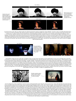
Video Links: CSS - Alala, Prodigy- Breathe, Delphic - Doubt, Two Door Cinema Club - I Can Talk, Kasabian - Vlad the Impaler, Arctic Monkeys - When The Sun Goes Down


Bellow I have portrayed how we have used, challenges and developed forms and conventions of existing media products when we created our ancillary products:


Tuesday 23 March 2010
Final Digipak

We kept the design of the digipak very minimalistic to mirror our minimalistic approach to both the video and the website. We kept the colours in black and white, again mirroring the desaturated video, and creating a striking contrast between the pale skin and white flower with the jet black hair, makeup and eyes, it is a very artistic approach which we think our target audience would find appealing. We kept the font simple using only two types, we used a simple list format on the back of the cover for the track list, and copyright detail at the bottom alongside a bar code which again creates a sense or realism to the product.


The inside of the digipak is again in black and white linking to the video and the website. The photograph on the left hand side is taken from the woods, linking with the video, and is the image used for the background of the website. The same font is used on the disc as the front cover creating consistency throughout the product.
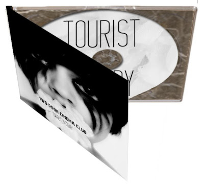

Hennie used her photo shop skills to make the digipak 3D, to portray how the digipack would like if it was actually constructed properly, this give our final digipak design a sense of realism
Individual responsabilities
When we first got into a group Rakhee, Hennie, Kelsey and I all decided that we wanted to contribute to our music video and ancillary task, we all wnated to be part of the creative decisions as well as the practical decisions. We all did our individual research and conducted our own experiments to show each other, but no decision was made without it beign run through every member of the group. However as we all had so much work to do we naturally had to take on individually responsabilities, the table below states the responsabilities we all took on, and why we did.

Final Magazine Advert

This is the final advert for our digipak, you can see how itl inks directly to the digipak, the font and images used all correlate well, creating identification and a set house style between our products. You can also see how it has developed from the first magazine advert I created, I have added hmv and bridge nine record labels to the bottom ot the poster to give the magazine advertisement a authentic edge. I have also added the bands website address, and name of their leading record label 'Kitsune' to the bottom of the page. Furthermore I have made the banners slightly transparent, which gives the poster a more sophisticated and stylised look, used to entice our target market to buy the album. The critics opinions are also used as a marketing tool to persuade the target market to purchase the album.
I have personally decided to hand this in as my final peice rather than the website, as our group did all three ancillary tasks we all have the freedom to choose which ones we would like to hand in.
Monday 22 March 2010
Magazine Adverts

These are a few images of magazine adverts that I have researched. They are are quite simplistic, with a main image which usually corresponds directly to the digipak they are advertising, more often than not the image used is the same image used on the digipak. The name of the artist is in the largest font, to capture their audience, and the font of the text is usually the bands trademark font, or logo. There is then limited information in smaller font simply stating the name of the album, the singles included, the date it is released, sometimes there are critics opinion or tour dates at the bottom. The artists website is usually placed in the bottom corner of the poster in small text, with logos of the albums representation.

Thursday 18 March 2010
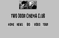
Final Website

You can see above how the website that Kelsey has made corresponds to the conventions of an existing band website beside it. The formating is very similar, with the boxes in the centre of the page breaking up the information, making it easy to read and asses the page.
Kelseys website has the conventional links associted with band websites 'Home', 'News', 'Blog' and'Video'. There is also a log in bar for people who are members of the fan club, which is a convention used on many websites to increase identification between the band and their fans.
Our music video also features on the page, the viewer is able to stop, forward, rewing, play and enlarge the video, making it incredibly easy for viewers to rewatch the video, or watch it whilst doing other tings online.
The website kelsey has created is incredibly proffessional looking and links in well with the black and white colour scheme that is used throughout all our products. The text also links to the digipak, creating an identifiable house style.
Second Website Idea
So from the first website idea of the black and white theme we changed the background to grey and the font a simplistic black and white. In addition I have changed the layout of the website, now it is more central. At the top there is a mock up of what I thought about having to show the link between the video and the website, but this image my change as it need to be more powerful. Also we made button to link to other pages. We thought that rollover button would look good on the web page as when the user moved over the button it will turn white and whatever page they are on the button will be white. To create the rollover button we made two images in Photoshop. 

Second Rough Cut
Untitled from Jack Osman on Vimeo.
The second rough cut got a lot more praise, especially for the introduction, which gives the video a powerful and exciting introduction sure to grab the viewers attention. However our teacher though that by having all the video in black and white we were detracting from the horror of the clown. She liked how at the end the mask changes from black and white to colour as though the fantasy of the video has finally been realised, but she said it would be a more effective video if more shots of the clown where in colour, especially the closeups of the clowns face. She also thought that the introduction was slightly out of time so needs to be tightened up.
The general reaction from pupils in our media class was that the introduction has definitley improved the video, and made it more exciting.
Magazine Adverts

The image above is from an issue of NME, a well known music magazine which our band Two Door Cinema Club is heavily associated with. I really liked the design of this advertisement, I thought it was really eye catching, and interesting, not only does it detail the realease of a debut single, but it also details a few tour dates. Below I have made a response to his magazine adertisement.


Below is another magazine advertisment I created individualy, without inspiration from another magazine advertisement.

Despite us only having to two ancillary tasks, our group decided to expand our skills onto all three of them in draft, as to make an informed decision once we have finished our project. These are two rough magazine advertisements for Two Door Cinema Club's album 'Tourist History'. We have used the photographs from the mock up digipak covers to create a clear link. Again the structure and colours are simplistic and sophisticated, playing off the stunning contrast of black and white.

Despite us only having to two ancillary tasks, our group decided to expand our skills onto all three of them in draft, as to make an informed decision once we have finished our project. These are two rough magazine advertisements for Two Door Cinema Club's album 'Tourist History'. We have used the photographs from the mock up digipak covers to create a clear link. Again the structure and colours are simplistic and sophisticated, playing off the stunning contrast of black and white.
Subscribe to:
Posts (Atom)