Showing posts with label Website Research. Show all posts

Thursday, 18 March 2010

Final Website


You can see above how the website that Kelsey has made corresponds to the conventions of an existing band website beside it. The formating is very similar, with the boxes in the centre of the page breaking up the information, making it easy to read and asses the page.
Kelseys website has the conventional links associted with band websites 'Home', 'News', 'Blog' and'Video'. There is also a log in bar for people who are members of the fan club, which is a convention used on many websites to increase identification between the band and their fans.
Our music video also features on the page, the viewer is able to stop, forward, rewing, play and enlarge the video, making it incredibly easy for viewers to rewatch the video, or watch it whilst doing other tings online.
The website kelsey has created is incredibly proffessional looking and links in well with the black and white colour scheme that is used throughout all our products. The text also links to the digipak, creating an identifiable house style.


Second Website Idea

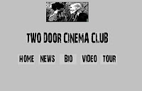
So from the first website idea of the black and white theme we changed the background to grey and the font a simplistic black and white. In addition I have changed the layout of the website, now it is more central. At the top there is a mock up of what I thought about having to show the link between the video and the website, but this image my change as it need to be more powerful. Also we made button to link to other pages. We thought that rollover button would look good on the web page as when the user moved over the button it will turn white and whatever page they are on the button will be white. To create the rollover button we made two images in Photoshop.

Website


This is the first rough draft of our website, it links in well with the website research, as most band websites have a dark background and simplistic pale writing.

Tuesday, 16 March 2010

Website Research


The pictures above are screen grabs of four alternative/indie bands websites, Placebo, Bloc Party, Strokes and Chew Lips. From looking at these screen grabs you can see that all the websites are similarly designed. Like the CD covers, the design is simplistic and sophisticated, the background colours are all dark, with pale writing for a bold eye catching contrast. The content of the homepage is very basic, with either one main photograph and links to other pages, or small pictures of current albums and singles, and touring details. The links are text rather than buttons, keeping with the simplicity of the designs. The main links are at the top of the page in a horizontal line to the 'Tour' page, 'Photos', 'Videos' and 'Band Bio'.