

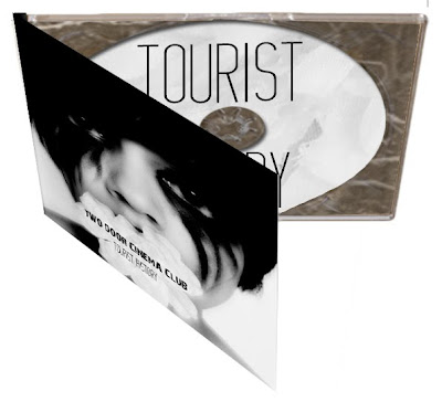
We kept the design of the digipak very minimalistic to mirror our minimalistic approach to both the video and the website. We kept the colours in black and white, again mirroring the desaturated video, and creating a striking contrast between the pale skin and white flower with the jet black hair, makeup and eyes, it is a very artistic approach which we think our target audience would find appealing. We kept the font simple using only two types, we used a simple list format on the back of the cover for the track list, and copyright detail at the bottom alongside a bar code which again creates a sense or realism to the product.


The inside of the digipak is again in black and white linking to the video and the website. The photograph on the left hand side is taken from the woods, linking with the video, and is the image used for the background of the website. The same font is used on the disc as the front cover creating consistency throughout the product.

Hennie used her photo shop skills to make the digipak 3D, to portray how the digipack would like if it was actually constructed properly, this give our final digipak design a sense of realism
No comments:
Post a Comment